A One-Page Event Handout That Works in a Busy Room
A one-page event handout layout helps people find times, rooms and next steps amid chatter, queues and quick glances, without forcing them to read every line.
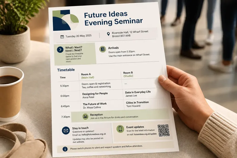
A one-page event handout layout has to earn a reader’s attention while people are standing, talking or moving towards the next session. Put the time, place and next action where a quick glance can find them; save the welcome message for a quieter moment.
In a busy room, the page competes with conversation, movement and notices on the walls. A useful layout makes its main route obvious, keeps related details together and remains readable in ordinary print. The practical question is not whether the page looks full, but whether someone can use it without stopping to decipher it.
What does a busy-room handout need to do?
Give the page one primary job, such as helping attendees choose a session and locate its room. Use that purpose to decide what earns space. The event name, date, venue, timetable and a contact route are common essentials; a long welcome or full speaker biography may be better suited to a website.
Consider the conditions in which someone will read it. A person holding a cup or bag has little patience for tiny type, distant labels or a schedule that requires repeated turns across the page. Put the most time-sensitive information near the top, use clear grouping, and keep directions in plain language.
Separate required facts from useful extras. If room locations are essential, retain them before adding sponsor messages or decorative copy. When space tightens, shorten secondary text rather than reducing the information readers need to act.
How should the reading order work in a crowded room?
Order information around the questions people are likely to ask: What is this event? What happens next? Where do I go? The sequence can change to suit the venue. If attendees arrive through several entrances, a concise arrival note may deserve a place above the timetable.
Group each schedule entry as a unit: time, session title and room should sit together. A single column often supports a straightforward top-to-bottom scan. Two columns can work when one holds the timetable and the other practical details, but make the division clear with headings and alignment; otherwise readers may assemble one answer from scattered fragments.
Say you are laying out an invented handout for an evening seminar with three talks in two rooms and a reception afterwards. You put the date and venue beneath the event title, then list each talk with its time and room on the same line or in one compact block. You place the reception and organiser’s email in a final, quieter section. The expected result is that someone arriving late can identify the next talk and its room without reading the welcome text.
Keep the route through the page visible, even when someone only gives it a passing glance.
How can type and spacing help people scan?
Use a small hierarchy: an event title, section headings and ordinary details. A separate style for session titles or room labels can help, but every additional style asks readers to learn another visual rule.
Coordinate type size, weight, alignment and spacing. A bold heading can mark a new section; consistent gaps can show which room belongs to which session. Do not rely on colour alone to carry essential meaning. Check that numerals, punctuation and room labels are distinguishable in the typeface you choose.
A single type family with different weights is a straightforward option. A text face paired with a restrained display face can also work, provided both remain legible at the size used on the printed page. If every line is bold, bold has stopped being useful and has become a general mood.
Use spacing to separate sections and keep each heading close to the material it introduces. Leave a clear edge around the page, rather than pushing small details into the corners.
What should the timetable make obvious?
Use a consistent time format and align times so readers can compare entries quickly. Keep a session’s time, title and location together, not in separate lists that require cross-referencing. Plain labels such as “Doors open”, “Break” and “Room B” answer practical questions without asking readers to interpret event jargon.
For simultaneous sessions, use distinct blocks or column headings and make their shared timing clear. Include a speaker’s name when it helps someone identify or choose a session; leave a string of affiliations out if it adds little to that decision.
A printed page cannot update itself. If details may change, include a named update channel, but keep essential printed information available for people who cannot or do not wish to check a phone.
Read each timetable entry from time to room. If the relationship breaks while you follow the line, regroup it.
What should you check on the printed handout?
Review the page at its intended print size, not only enlarged on a monitor. A plain office print can reveal faint text, cramped spacing or an awkward line break that a bright screen conceals. Check practical facts against the organiser’s current information, including names, times, room labels, venue and contact details.
Ask someone unfamiliar with the event to find the next session and the entrance. Let them look without explaining the design. A pause or a wrong turn may indicate that a label needs clarification or that two blocks look too similar.
- Observe whether the event name and date stand out at a glance; if either is hard to locate, move it higher or give it clearer typographic emphasis.
- Observe whether each timetable entry keeps its time, title and room together; if one detail drifts away, regroup the entry before printing.
- Observe whether section headings look distinct from ordinary details; if they do not, adjust weight, size or spacing rather than adding another decorative device.
- Observe whether readers can identify the entrance or arrival instructions; if they search for them, move the directions closer to the event details or make the wording more direct.
- Observe whether the contact route is easy to find; if it disappears among paragraphs, place it in a clearly headed practical-information block.
- Observe whether the smallest text remains clear on an ordinary print; if it blurs or crowds the edge, enlarge it, simplify the copy or revise the layout.
- Observe whether a QR code has a plain-language label and a printed alternative for essential details; if not, add the label and keep those details on the page.
Record the decision beside each check: retain, regroup, clarify or remove. “Looks fine” is a poor instruction for the person preparing the print file.
Which layout questions come up most often?
Should an event handout use one column or two?
Use one column when the information follows a simple sequence or readers should scan from top to bottom. Two columns can separate a timetable from practical details, provided headings and alignment make the relationship plain.
Should every session have its own box?
Not necessarily. A box around every entry can make the schedule look like a row of unrelated notices. Try spacing or alignment first, and reserve boxes for genuinely separate tracks or special information.
Where should a QR code go on a one-page handout?
Place it beside the information it extends, such as a live-update note, and label what it opens. Keep essential times and locations in print so the phone remains optional.
What if event details change after printing?
For a minor correction, organisers may use a clearly marked insert or make an announcement at the venue. If changes are likely, name an update channel on the handout while keeping the printed schedule useful on its own.
How do you finish the file without creating fresh confusion?
Make final changes only when they improve accuracy, order or legibility. Confirm the copy, export to the printer’s requested settings and inspect the resulting file for missing fonts, clipped text and unexpected line breaks. Follow the printer’s specifications for page size, margins and colour.
Keep one editable source and one clearly named final file. If a correction arrives, it should be obvious which version needs changing; a folder of near-identical files is not a filing system so much as a modest puzzle.
A one-page event handout layout works in a busy room when readers can spot the next useful fact without being taught how to read the page. Keep the schedule’s time, title and room together, and preserve enough contrast and space for a quick scan. Even a short printed contact route can help when the room is noisy and the phone is out of reach.