Why Letter Spacing Changes the Pace of a Page
Letter spacing changes the texture and reading rhythm of a page. Learn what to compare in type, from counters and word shapes to line breaks.
A heading set in tight letter spacing can feel brisk before you have read a word; the same letters, opened out, may seem deliberate or aloof. Letter spacing changes the pace of a page by altering the texture of words and the amount of visual effort they ask from the eye. Compare the spaces between letters, but also watch what happens to words, lines and the page around them.
What does letter spacing change first?
Letter spacing is the adjustment of space between characters across a run of text. In many design applications it is called tracking. It differs from kerning, which adjusts the gap between a particular pair, such as T and o. A typeface’s default spacing already accounts for ordinary reading; tracking shifts that spacing more broadly.
The immediate change is texture. Closely set letters form a darker, more compact band, while wider spacing lets more background show through. Neither quality is inherently more legible. The result depends on the typeface, size, weight, words and setting.
Start by comparing a short word in the same typeface and size at its default spacing, then slightly tighter and looser. A pair of letters may improve while the word as a whole becomes less even. Look at the whole word, not just the most conspicuous gap.
How does spacing alter reading rhythm?
Reading is not a procession of isolated characters. The eye recognises familiar word shapes and moves through lines in groups. If letters are spread apart, those shapes become less compact; the eye may give more attention to individual characters and less to the word’s overall silhouette.
This can slow a heading in a useful way. Open spacing may make a short label feel measured, or help a few capital letters occupy a line without adding a heavier font. The same treatment across a paragraph can make ordinary reading feel laboured. Tight spacing can lend a headline urgency, but at an extreme, letters crowd and their forms become harder to distinguish.
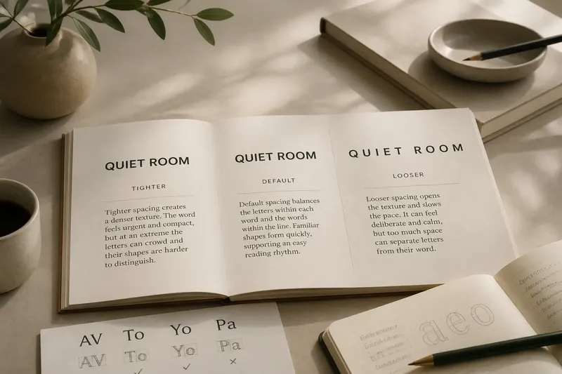
Imagine a museum notice whose heading is “QUIET ROOM”. If the letters feel too dense, a designer might open the spacing slightly and compare the full line against the body copy. The expected visible result is a lighter, more separated heading; if it starts to look like a sequence of unrelated characters, the adjustment has gone too far.
When assessing pace, ask whether the text is meant to be scanned, announced or read continuously. A display heading can tolerate a more noticeable texture than a long caption. Readability is a property of the arrangement, not a virtue earned by adding air.
What should you compare in a type specimen?
A useful comparison keeps other variables still. Hold the typeface, size, weight, colour and line length constant, and change only the spacing. Otherwise, a heavier weight or a larger size may be doing the work you attribute to tracking.
- Word shape: Do familiar words still read as coherent units, or do their letters seem detached?
- Counterforms: Are the enclosed spaces in letters such as a, e and o still distinct at the chosen size?
- Pair gaps: Do combinations such as AV or To look awkward, even if the general spacing seems sound?
- Line texture: Does the text make an even grey band, or do isolated gaps interrupt it?
- Line endings: Does the new spacing push a word onto another line or leave an accidental-looking short line?
- Surrounding space: Does the heading still relate comfortably to its margin and nearby text?
Look at the specimen both close up and at the scale where it will be read. Close inspection reveals troublesome pairs; viewing it at page size shows the overall rhythm. On screen, zooming out can help, but check the final output too, since a display preview may not match printed or exported text.
When is tighter or looser spacing useful?
Tighter spacing can make a large headline feel compact and forceful, particularly when the typeface has generous default spacing. It can also help a short wordmark occupy less width. But the letters need enough room to keep their shapes distinct, and a narrow line is not automatically a better-composed line.
Looser spacing often suits uppercase labels, short navigation terms and small display lines. Capital letters have relatively uniform heights and can form a dense-looking row, so a modest opening may make them easier to scan. Lowercase text has more varied shapes and established word patterns; spreading a long passage can disrupt those cues.
For small text, judge spacing with particular care. Enlarging gaps may seem to separate crowded forms, but it also lengthens each word and can create uneven-looking lines. If a caption remains difficult to read, consider whether the typeface, size, weight or contrast is the real issue instead of asking tracking to solve everything.
Which questions help you judge letter spacing?
Is letter spacing the same as kerning?
No. Letter spacing, often called tracking, adjusts gaps broadly across a selected run, while kerning changes the relationship between specific pairs. A line can have sensible overall tracking and still contain an awkward pair.
Why do capitals often look crowded?
Capitals tend to create a regular band of similar-height forms, which can look dense in a short heading. A little extra room may make the line breathe, but too much spacing can break its words into separate characters.
Should body text have extra letter spacing?
Not by default. Body text depends on recognisable word shapes over sustained reading, so broad spacing changes can make those shapes less compact and the lines less even.
Why does spacing look different in another typeface?
Letterforms, proportions and built-in spacing vary between typefaces. The same adjustment can look subtle in one face and conspicuous in another, so compare the actual words in the chosen typeface rather than relying on a setting alone.
How can you make a useful comparison?
Set the same short heading in three versions: default spacing, a slightly tighter setting and a slightly looser one. Keep the line length and surrounding layout unchanged. Put the versions side by side, then cover their settings and judge which reads at the intended pace. This is a visual comparison, not a contest to find the most dramatic version.
Next, inspect a longer line in the same treatment. A spacing choice that gives a heading a composed quality may cause body text to break differently or develop a patchy texture. Check the actual words and line endings rather than judging from a row of repeated letters.
Letter spacing is easiest to assess as a relationship: letter to letter, word to word, and line to page. In a comparison, note where the rhythm changes, not merely whether the text looks more open. That is the useful part of reading typography: the setting matters less than what it makes the reader’s eye do.