The Arrow Before the App Icon
Trace the arrow before the app icon through documented print examples, and learn to distinguish directional marks from symbols assigned an interface action.
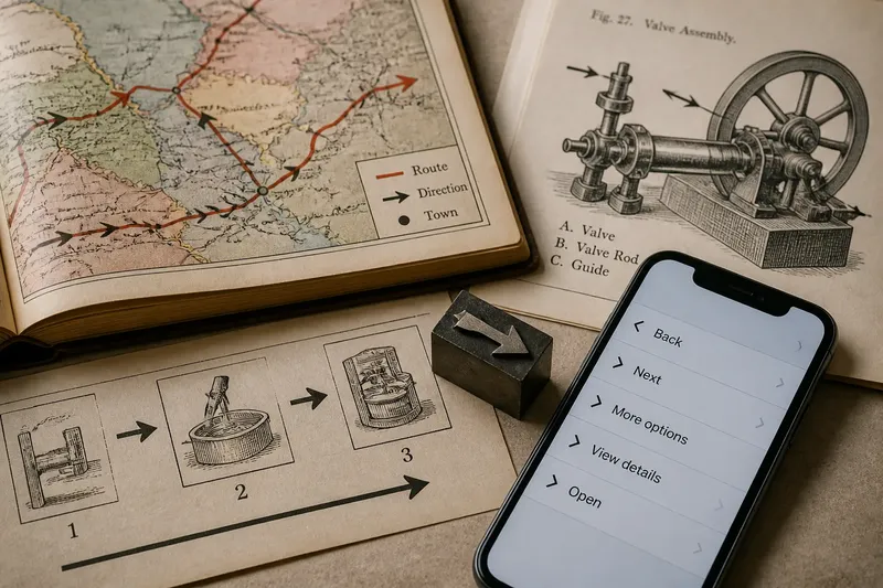
The arrow before the app icon can be seen in printed books and diagrams, where it did practical work long before it became a screen control. In a folded road map, a printed arrow may mark a route; in a technical drawing, one may point towards a part. These uses are visible evidence, unlike the tempting but difficult claim that arrows began with one ancient gesture.
What can printed arrows tell us about their history?
Look at an atlas, a railway map or a technical manual and the arrow’s job is concrete: it directs the reader’s eye or indicates a route, movement or sequence. The surrounding material matters to historical interpretation. A caption, legend or diagram may establish what the mark means without requiring a theory about where the shape originated.
Printed arrows are also evidence of reproduction. A woodcut, engraved plate or later typeset mark could be used as part of a page rather than drawn anew each time. Their appearance varies with the printing method and the task: some have a shaft and distinct head, while others are compact pointers. This is not a single march towards a standard form; it is a record of designers adapting a mark to available space and purpose.
When tracing a particular arrow, inspect the page it belongs to. The date and publication, if known, tell you when that example was used, not when the arrow itself was invented.
How did the printed arrow become visual punctuation?
On a printed page, an arrow can connect a label to a detail, show the order of stages, or indicate travel across a map. Its meaning comes partly from the diagram or legend, but its point gives the eye a clear destination. In this role, the arrow behaves less like a picture of a gesture and more like punctuation: it organises how information is read.
Reusable type and illustration made it possible to place directional marks consistently across a publication. A reader might encounter the same graphic convention in several diagrams, though the convention still depended on explanation. An arrow in a map legend need not mean the same thing as one beside a callout in a machine drawing.
For a design-history account, the useful question is not whether every printed arrow followed a straight path towards the screen. It is what a specific page asked the mark to do, and what other graphic elements supported that job.
Why did interface arrows become so compact?
Screen controls often need to fit beside text, inside a menu or at the edge of a panel. Designers can draw a chevron with two strokes or use a fuller arrow with a shaft and head. The choice is not merely decorative: a compact mark saves visual space, while a fuller shape can make direction more explicit.
Interface conventions also assign actions to shapes. A left-pointing arrow may serve as a back control; a chevron may indicate that a menu opens or a list expands. These are conventions of particular interface designs, not meanings that can be inferred from the outline alone. A label such as “Back” or “Next” can make the assigned action explicit.
This is where the history changes character. On a printed diagram, an arrow commonly directs attention within information. In an interface, it may be an actionable control that changes what appears on screen. The same shape can therefore function as a mark on a page or as part of an interaction.
What questions help distinguish interface arrow types?
Does a chevron mean the same thing as an arrow?
No fixed rule makes them interchangeable. A chevron often marks expansion or movement into a menu, while a shaft-and-head arrow may suggest a route or a back action; labels and surrounding controls clarify the particular design.
Why does a left-pointing arrow often mean “back”?
Some interfaces use leftward direction to represent returning to an earlier screen, especially in layouts read from left to right. Treat that as a learned convention, not a universal rule; the control’s label and position can confirm or complicate it.
Can an arrow work without a text label?
It can when the interface makes its action clear and the symbol is familiar to its intended readers. If several actions seem plausible, a short label may communicate more clearly than extra detail in the drawing.
What makes an arrow appear interactive?
A button boundary, placement among controls and a visible response to selection can signal that an arrow is actionable. An arrow inside a static illustration may point just as clearly without inviting a click or tap.
How can a concrete redesign clarify an arrow’s job?
Say a small museum has a printed visitor map with a plain arrow beside a gallery route. The starting point is a mark whose point is visible but whose destination is not named. The designer adds the words “Gallery entrance” beside the arrow, then checks that the point meets the route line at that entrance. The resulting decision is clear: retain the arrow if it points to the named place; redraw or reposition it if it points elsewhere. The label supplies a destination, while the line gives the mark a specific route to follow.
Now imagine that the museum uses a similar arrow on a screen to open a panel. If the arrow points left but the panel appears from the right, the visual cue and the movement conflict. The designer can change the arrow, adjust the panel movement or add a label that states the action. This is a design choice about the interface, not evidence that one arrow shape has a timeless, settled meaning.
What does the arrow before the app icon leave behind?
The arrow before the app icon is best understood through identifiable uses rather than an unsupported origin story. Printed maps and diagrams show how the mark could direct attention, indicate a route or organise a sequence; interface controls show how designers later assigned actions to familiar directional forms. These are related uses, not proof of one unbroken history.
When you encounter an arrow in a design-history example, note the publication or interface, the task the mark performs and the evidence visible around it. That approach keeps the account precise: a particular arrow can be dated and interpreted in context without pretending that its first appearance is known.