The Myth of the Universally Obvious Icon
Universally obvious icons are rarer than they look. Learn to check an icon’s visual form, state and label so its purpose is clear before anyone acts.
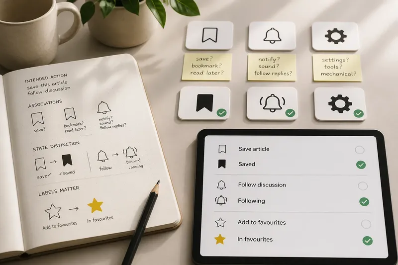
A bell beside a discussion thread might mean “follow replies” to one reader and “turn sound on” to another. The problem is not simply that the bell lacks context; its shape has become a small piece of visual shorthand asked to carry an exact instruction. To judge an icon fairly, examine what its drawing communicates, how its state appears, and whether a label gives the control a definite name.
What does the icon itself suggest?
Start by describing the visible shape without deciding what the interface intends. A bookmark resembles a marker for a page, but in a particular product it might save an item, add it to a reading list or mark a place for later. The drawing offers a clue, not a contract.
Write the intended action as a plain verb phrase: “save this article” or “follow this discussion”. Then compare that phrase with the shape’s most likely everyday associations. If they point in different directions, the icon is doing too little instructional work on its own.
This is a visual-literacy question as much as an interface question. Icons borrow from familiar objects, yet their meanings shift with convention, culture and repeated use. A gear can suggest settings to experienced software users; to someone else, it is simply a gear.
Name the action before deciding that the picture is self-explanatory.
Does the icon show what state it is in?
An icon can be recognisable while leaving its current state uncertain. A filled bookmark might mean “saved”, “save this” or merely a different drawing style. The distinction matters because an instruction and a status are not the same thing.
Check whether the control communicates both what will happen next and what is already true. If the symbol changes after activation, make the change perceptible through more than a subtle shift in hue: a changed shape, a visible text label or a clear status message can help. Do not make colour the only signal.
Imagine a library app with an outline bookmark beside an unsaved article. You intend a tap to save it. A reader taps, the bookmark fills, and the adjacent text changes from “Save” to “Saved”; the visible result makes both the action and its new state easier to distinguish.
How can you tell when an icon needs a label?
A visible label earns its space when the drawing has several plausible readings, the action is unfamiliar, or a mistaken interpretation would matter. Keep the wording close to the icon so readers see them as one control: “Follow discussion” beside a bell is more precise than an explanation elsewhere on the page.
Use a direct verb that describes the result, not the illustration. “Open menu” is an instruction; “three lines” is an inventory of the artwork. A tooltip can supplement a label, but it is a poor sole explanation for a control whose purpose needs to be understood before someone selects it.
There is no need to label every familiar symbol automatically. The question is whether the drawing and its visible wording together make the intended action distinct from reasonable alternatives.
How should an icon be reviewed before use?
Review the icon as a small visual decision, not as a vote on whether the artwork looks attractive. For each check, note the observation and decide what to change if it does not support a clear reading.
- Intended action: Check whether the control has one short verb phrase; if it does, keep that phrase for comparison, and if it does not, define the action before choosing an icon.
- Shape associations: Check whether the drawing suggests a second plausible action; if it does, add a visible label or select a less ambiguous symbol, and if it does not, retain the shape for the next check.
- State distinction: Check whether active and inactive states differ through shape or wording as well as colour; if they differ only by colour, add another visible state cue, and if they already differ clearly, keep the existing treatment.
- Label placement: Check whether the label sits beside the control it explains; if unrelated content separates them, move the label closer, and if the pairing is immediate, leave the placement intact.
- Consequence: Check whether an incorrect selection could delete, publish or otherwise change something important; if it could, use explicit wording and an appropriate confirmation, and if it cannot, a concise label or established symbol may be sufficient.
- Non-visual name: Check whether assistive technology receives a clear accessible name for an icon-only control; if the name is missing or vague, provide a direct action label, and if it names the action accurately, retain it.
Say a museum catalogue team is reviewing a star beside an object record. The team writes “add this object to favourites” as the intended action, then notes that the star could also mean “featured” or “highly rated”. It places “Add to favourites” beside the star, changes the label to “In favourites” after selection, and ensures the accessible name reflects that state. The resulting control distinguishes saving from rating without asking the star to explain the whole interaction.
Which icon questions are worth asking?
Can a familiar icon stand without a label?
It can, when the symbol has one strong reading in its setting and the action is straightforward. If plausible interpretations diverge, visible wording is a better remedy than confidence in convention.
Can colour alone show that an icon is active?
It should not be the only distinction. Pair colour with a change in shape, text or another perceptible state cue so the difference remains legible without colour discrimination.
Is a tooltip enough to explain an icon?
Not when readers need to understand the control before using it. A tooltip may add detail, while visible wording and an accurate accessible name identify the action more directly.
What if one icon could represent two actions?
Separate the actions into distinct controls when they produce different results. If only one action is intended, label it with a direct verb and avoid asking an ambiguous image to settle the distinction.
How can labels remain concise?
Choose the shortest wording that distinguishes the action from its nearest plausible alternative. “Save” may be enough beside a familiar bookmark; “Follow replies” says more than “bell” when the control changes a discussion subscription.
Use consistent terms for the same action across the interface, and keep labels readable in the actual layout. If space is tight, reconsider whether the control belongs there before hiding the words that make it intelligible.
The myth of the universally obvious icon persists because familiar drawings feel like plain language. Treat the image instead as a hint: check what it suggests, make its state visible, and give it a precise name wherever the hint leaves room for doubt.